Hello! It’s been quite a while since I last posted anything here, so here’s a bit of a bumper bundle to show some of what I’ve been up to during my absence!
I suppose it makes sense to work through it all in order that I did it, so first thing’s first…

First up, here are three designs I did to interest a T.V/Radio listings magazine.
As it’s really the radio listing pages which carry the bulk of the illustrations for the magazine, it was these I was targeting. All the illustration adhere to the relevant dimensions- the reproductions would appear less than three inches at the longest edge, so it was quite interesting to see how I could convey what I wanted without it getting cluttered and losing detail. All the images are based around radio programmes aired in the last twelve months and they are, “Beatles Christmas”, a documentary which examined how The Beatles marked the festive season while they were an active unit. I chose to use elements covered in the programme including their 1967 film “Magical Mystery Tour” and the fan cub flexi-discs issued between 1963 and 1969. Their own Apple label logo I thought made a fine substitute Christmas pud and I don’t think anything says Christmas more than crackers, so I thought that putting their likenesses on the labels illustrated the theme nicely.

Next we have “Diary of a Madman”
This image is based on a production of the Nikolai Gogol short story starring Kenneth Williams. Originally recorded as the soundtrack to an unproduced early 1960’s animation, the recording was adapted much later by BBC Radio Four into a play, which has been broadcast several times by Radio Four and Radio Four extra.
In this I wanted to show the disturbed psyche of the main character, a lowly clerk, including his obsession with his manager’s daughter, his paranoia resulting in him thinking that dogs are conspiring/talking about him and his ultimate delusion that he is in fact the King of Spain. This is actually a reworking of a piece I did a while back. For this new version I was able to base the portrait of the main character on Williams and much prefer the result to the original!

Thirdly there is “Vampirella”.
This piece is for the full cast radio play “Vampirella” written by Angela Carter originally produced in the 1970’s.
For this, I decided to concentrate on the titular character, a lonely female Vampire. Throughout the play, she is referred to as pale and trapped, (the blood trails from a Vampire’s bite wound acting as prison bars and the bat wings in the background signifying both her heritage and her true nature). In the play, her pet caged Skylark symbolises her entrapment and longed for innocence and purity. To that end, I rendered both her and the Bird as pale silhouettes, with the latter making it’s escape to freedom, echoing the climax of the play.
I thought I’d play with the frame on this one, and make it look as though the Skylark is escaping from the constraints of the illustration itself and off the page.
Next, also for the listings mag, and to show how my work looks on a bigger scale I thought it fitting to cover a soon to return alien from Doctor Who…
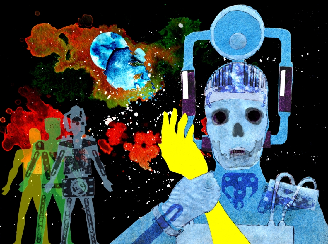
“Dr. Who- The Tenth planet”
This piece is based around the Cybermen’s first appearance in Dr. Who in 1966. For this, I wanted to show the idea of the Cybermen’s evolution from man to man/machine hybrid. The background figures show the starting point from organic (the yellow humanoid figure) progressing to the machine state. The foreground figure grasping the arm of a humanoid signifies the continuous process of domination and conversion.
In the background the Earth is seen with the Cybermen’s own planet (an erstwhile “twin” planet of our own) which is decaying as in the climax of the story.
I’d actually finished this and was getting ready to send it along with the others when It was announced that the original 1966 Cybermen were returning to the screens, so I was being more contemporary than I’d thought, which is nice!
Finally, and bringing things more or less up to date, is an image inspired by an article in Fortean Times Magazine- a publication which, if you are unfamiliar with it, reports on and investigates strange phenomena and beliefs with an open and inquiring but critical mind.

They recently featured an article entitled “The Haunted Generation”. This concerned in part the disquiet felt by some children growing up in the 1970’s at some Television programming. This struck a particular chord with me, I must admit, as I remember being particularly spooked by some of the Public Information Films shown. Honestly, from what I gathered, it was a forgone conclusion that if you went out to fly a Kite it would get tangled in an electricity pylon and you’d be electrocuted! Similarly, Death could easily be found hanging around dirty streams waiting for some hapless child to fall in and meet a sticky end (“Oh Dear”, Death would gleefully intone, sounding remarkably like Donald Pleasance, “That branch is rotten, it will never take his weight!”) Yep, that’s right- for a child growing up the 70’s were terrifying! And if the T.V wasn’t enough, we also had Abba (shudder!). The article mentions these films, and also programmes themselves which had affected some. In my image I have used three images used in the actual article, (from Left to right; the opening titles from “Bagpuss” featuring some strange Edwardian looking children”, “Dark and Lonely Waters”, the public information film described above and “Penda’s Fen”, A Play for Today, which centred around a devoutly religious teenager struggling with the acceptance of his own homosexuality. These are three of the key subjects of the article.
The main image though, is of a 1970’s TV set showing a corruption of that era’s iconic BBC One indent. It’s all laid out in what I hope is a suitably 70’s style, and I actually had an awful lot of fun doing this! For a change, most of the imagery is created digitally, although the distortion of the skulls was done “live”; I moved the individual skull pictures as I was scanning them, as I wanted to be surprised at the shapes they would make. I then edited them together and added the text to make the final screen image layout. I thought that adding noise would replicate those days of dodgy reception and added a faint double image, a characteristic of received broadcasts in those days. One thing that I remembered while doing that, was that the double imaging was actually called “Ghosting”!!
I tell you, the 70’s were out get the sensitive children!
Anyway, that’s all for now, so thanks for stopping by and hope to see you again soon!
